When it comes to branding, the clothes your employees wear play a significant role in how your business is perceived. Branded workwear not only enhances a professional image but also serves as a walking advertisement for your brand.
One of the critical elements of effective branded workwear is colour. Understanding the psychology behind colour choices can help you make decisions that resonate with your target audience and accurately represent your brand's values.
1. Why is Colour Important in Branded Workwear?
Colour can evoke strong emotions and associations in people. When you see a fast-food restaurant branded in bright red, it might stimulate feelings of excitement or hunger. On the other hand, a company that uses soft blues and whites might come across as more serene and trustworthy.
2. The Psychology of Colours
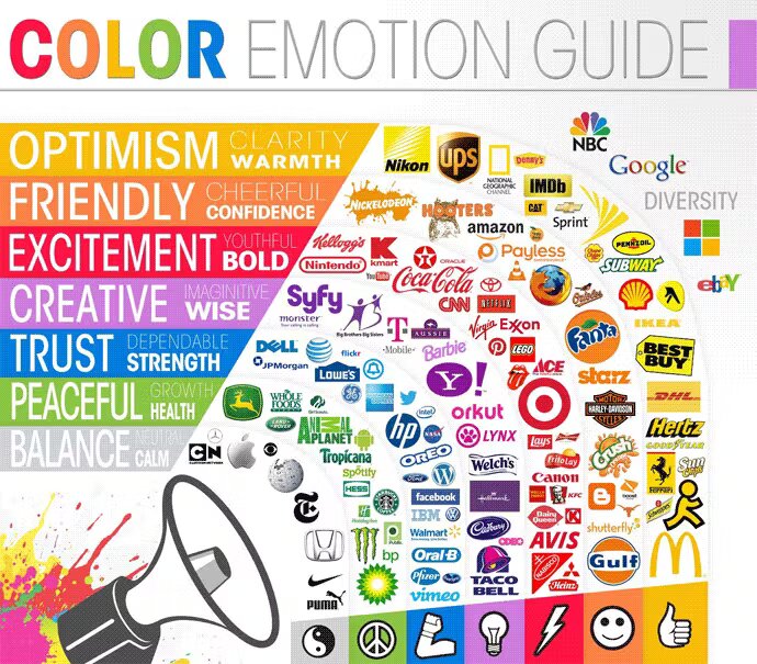
a. Red: Represents passion, excitement, and energy. It's attention-grabbing and might be ideal for businesses that want to stand out, like those in the food or entertainment industries.
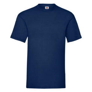
b. Blue: Symbolizes trust, calm, and loyalty. Many corporate businesses and financial institutions leverage blue to inspire confidence in their brand.
c. Green: Often associated with health, tranquility, and nature. It's perfect for businesses linked with the environment, wellness, or organic products.
d. Yellow: Represents optimism, warmth, and clarity. Brands wanting to evoke feelings of happiness and positivity might opt for yellow.
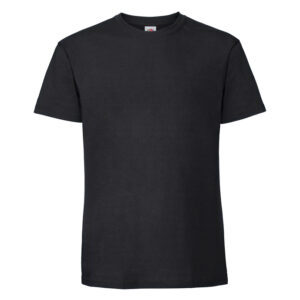
e. Black: Denotes sophistication, luxury, and formality. High-end brands and luxury services often use black for a sleek, premium look.
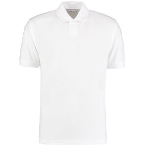
f. White: Reflects simplicity, purity, and clarity. Brands going for a minimalist or clean approach might lean towards white.
Best known brands and how they use colour to elevate their brand!
3. Matching Brand Values with Colour Choices
Once you understand the psychology behind each colour, the next step is to match these with your brand's values and goals. For instance, if you’re a health and wellness brand, greens and blues might be more fitting, whereas a creative agency might opt for vibrant colours like red or orange to display their zest for innovation.
4. Consider Colour Combinations
It's not just about choosing a single colour. The combination of colours can also convey different messages. For instance, red and white can imply clean, straightforward energy, while blue and gold can evoke feelings of regal trustworthiness.
5. Remember Practicality
While colour psychology is vital, don't forget the practical aspects. For instance, lighter colours might show stains easily, making them unsuitable for industries like food or mechanics. On the other hand, darker colours may be too hot for outdoor workers in sunny climates.
6. Consistency is Key
Ensure that your branded workwear aligns with other brand assets like your logo, website, and marketing materials. Consistency builds brand recognition, which is essential for building trust and loyalty among consumers.
Need branded clothing, then fill out our form below!
Conclusion
Selecting the right colours for your branded workwear isn't just about aesthetics; it's about effectively conveying your brand's message and values. By understanding the psychology behind colour choices, you can design workwear that not only looks good but also resonates deeply with your audience, making your brand memorable for all the right reasons.
Most popular clothing to get branded
- What is the importance of colour in branded workwear?
- Colour plays a pivotal role in branding as it evokes emotions, conveys brand values, and enhances recognizability.
- How do colours impact customer perception?
- Colours can evoke specific emotions and associations in people's minds. For instance, blue might convey trustworthiness, while red can suggest energy and passion.
- Which colours are considered the most professional for workwear?
- Neutral colours like black, white, navy, and gray are often deemed professional. However, the best colour often depends on the industry and the brand image one wants to project.
- How do I choose the right colour for my company uniforms?
- Begin by understanding your brand values and the emotions you want to evoke. Research colour psychology and consider factors like practicality and industry standards.
- Is it essential to match workwear colours with my logo or brand colours?
- For brand consistency, it's beneficial to have colours that align with or complement your logo and other brand assets.
- Do different industries have specific colour preferences for workwear?
- Yes, for example, medical professionals often wear white or light blue, while construction workers might wear high-visibility colours like neon orange or yellow.
- How does colour psychology differ across cultures?
- Colours can have different meanings in various cultures. For instance, while white might be associated with purity in one culture, it could signify mourning in another.
- Can I use multiple colours in my branded workwear?
- Yes, but it's essential to ensure the colours complement each other and convey the intended brand message without being overly busy or confusing.
- Is it better to choose trendy colours or stick to classics for branded workwear?
- While trendy colours can make a brand seem contemporary, classic colours ensure longevity and timelessness in brand perception. It depends on the brand's goals and target audience.
- How often should I update or change the colours of our company uniforms?
- It depends on factors like wear and tear, rebranding efforts, and changing company values or targets. However, it's generally not advisable to change frequently, as consistency helps in brand recognition.
-
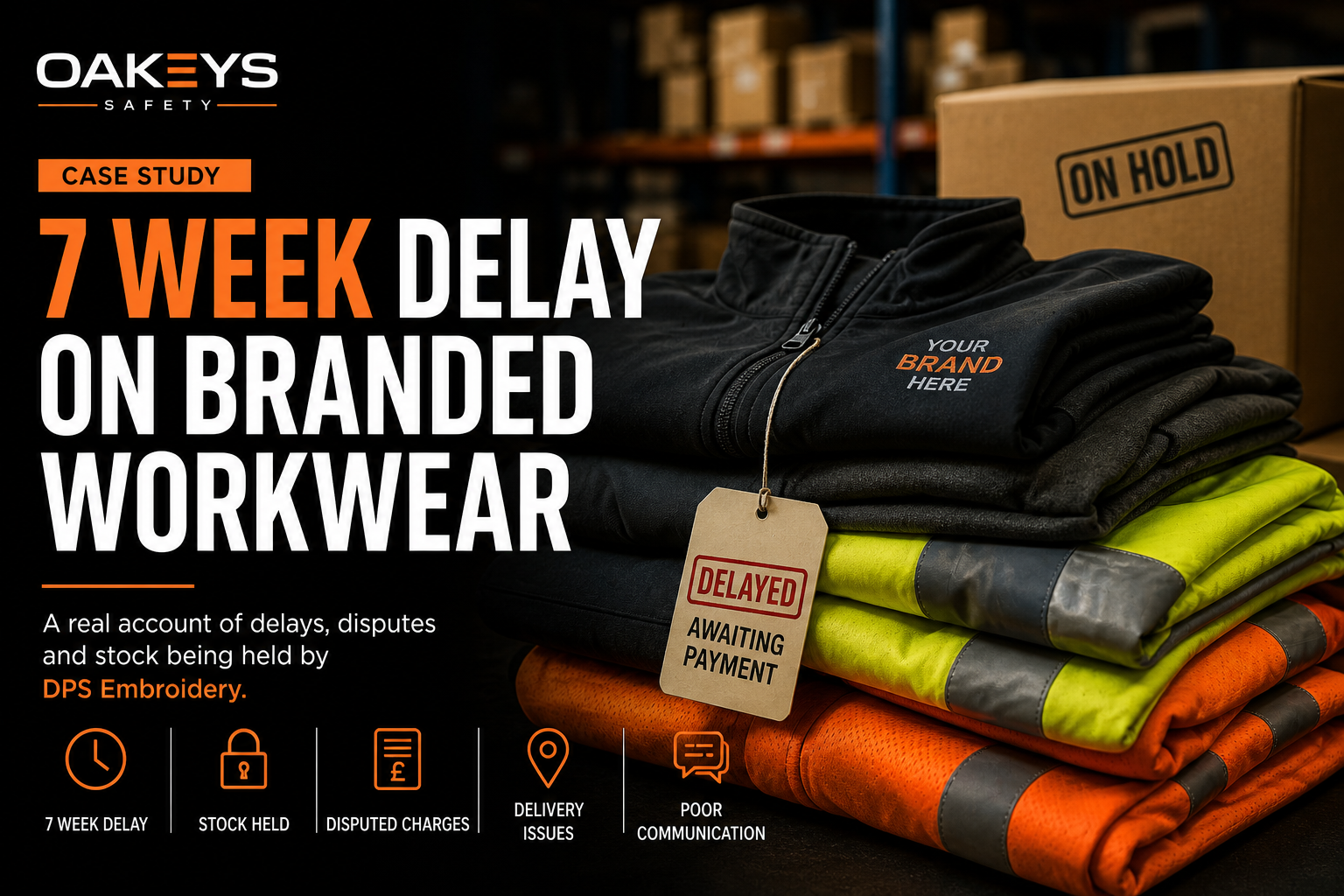
At OAKEYS Safety Ltd, we deal with branded workwear every day. Most orders follow a simple process: This case did not follow that pattern. What follows is a factual account of our experience working with DPS Embroidery (46 Hallam St, Balsall Heath, Birmingham B12 9PS), based on documented email correspondence across multiple orders. The Setup…
-
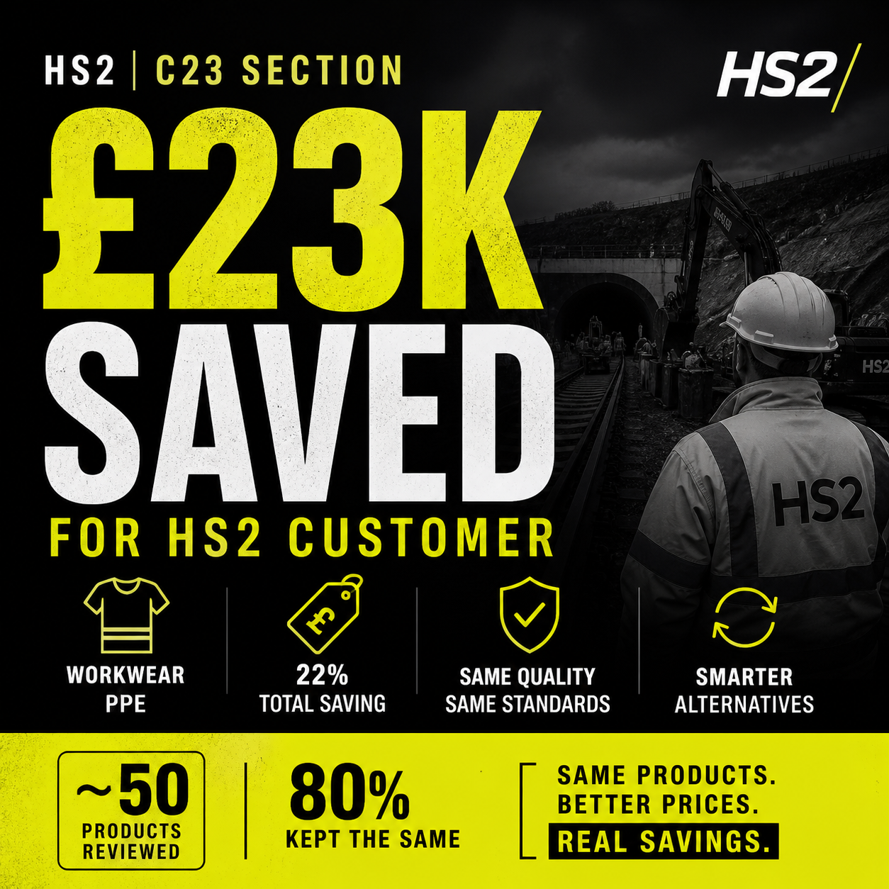
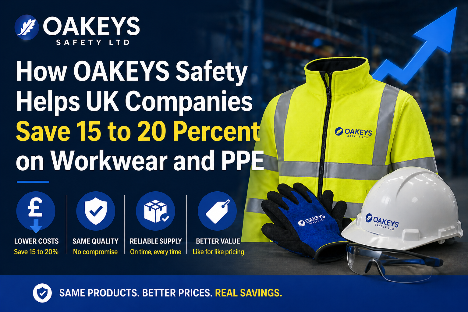
Most construction companies assume their workwear and PPE pricing is “about right”. In reality, we’re consistently seeing 15–25% savings available - without changing specifications, brands, or compliance standards. Here’s a real example from a contractor working on the HS2 C23 section. The Situation We were asked to review a company’s current workwear and PPE spend.…
-
If you are searching for cheap hi vis workwear, where to buy workwear, or a reliable PPE supplier in the UK, you are not alone. Most companies want better pricing, but very few actually know what they should be paying. At OAKEYS Safety Ltd, we have worked with over 50 UK businesses to compare their…